Project
Playbook Travel
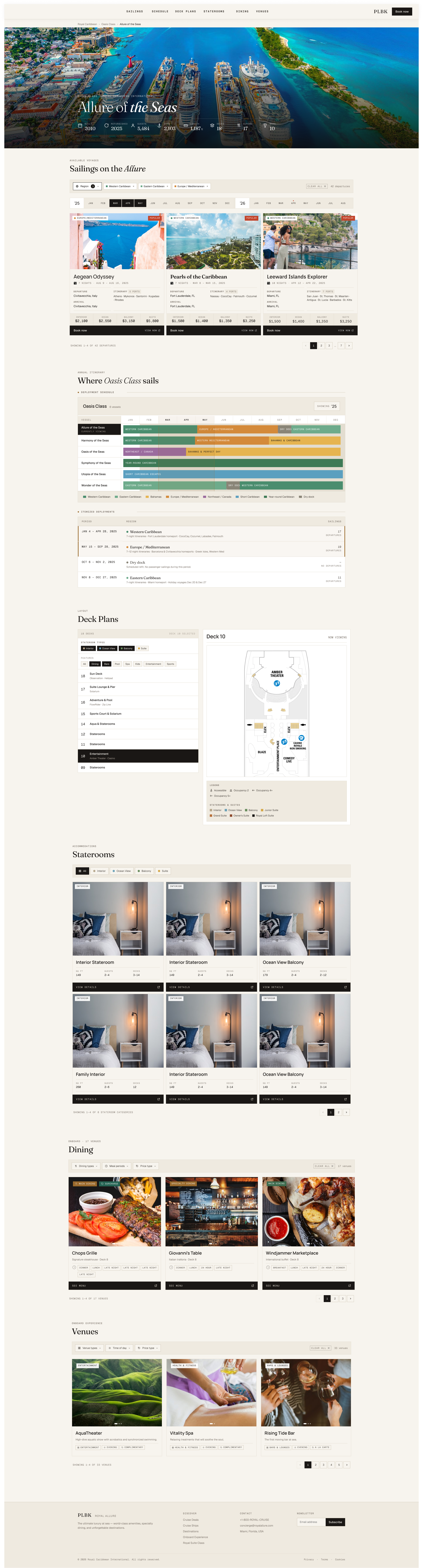
Cruise booking is notoriously complex. It's a mountain of information across ships, itineraries, ports and pricing. The challenge was presenting that complexity in a way that felt approachable, without stripping away the depth that users actually need.
01Marketing Website
When I joined Playbook, my first task was designing and building the company's marketing website from the ground up. Working in Squarespace with custom code, I established the visual identity and brand language that would carry through into the broader platform design. That foundation informed everything that followed.
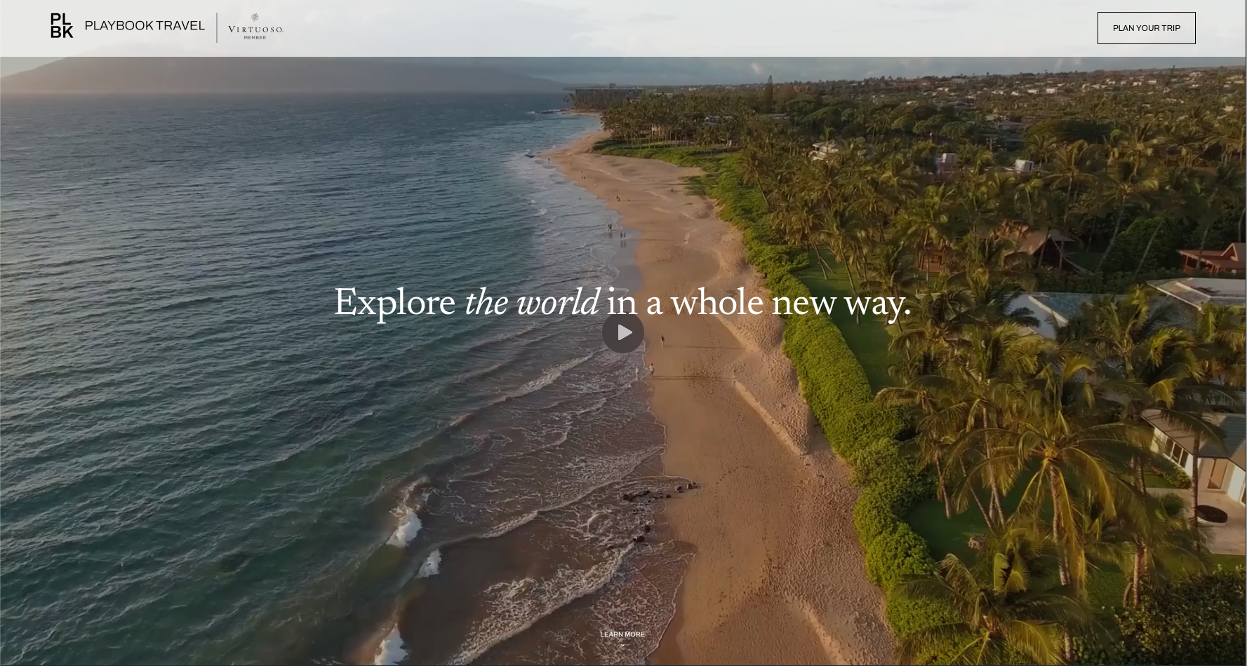
Click to visit plbk.com ↗
02Comparison
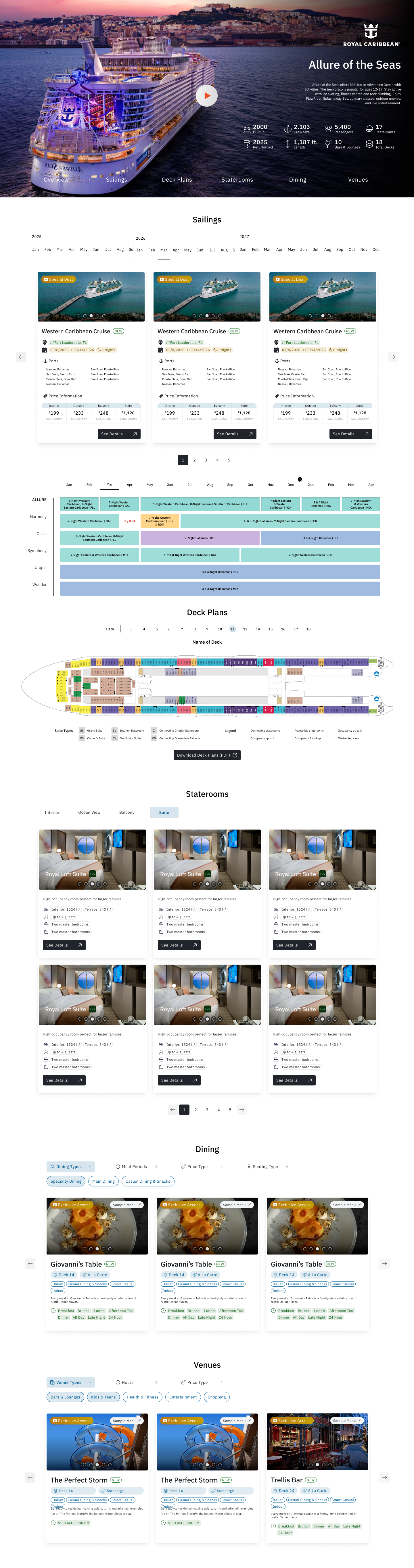
Cruise Critic and Vacations To Go — the largest cruise agency in the market — both carry the information users need, but the presentation makes it hard to actually use. The Playbook screens below are sections of the finished ship detail page, pulled out and set against their equivalents so the difference is easy to see. The process that got there follows.
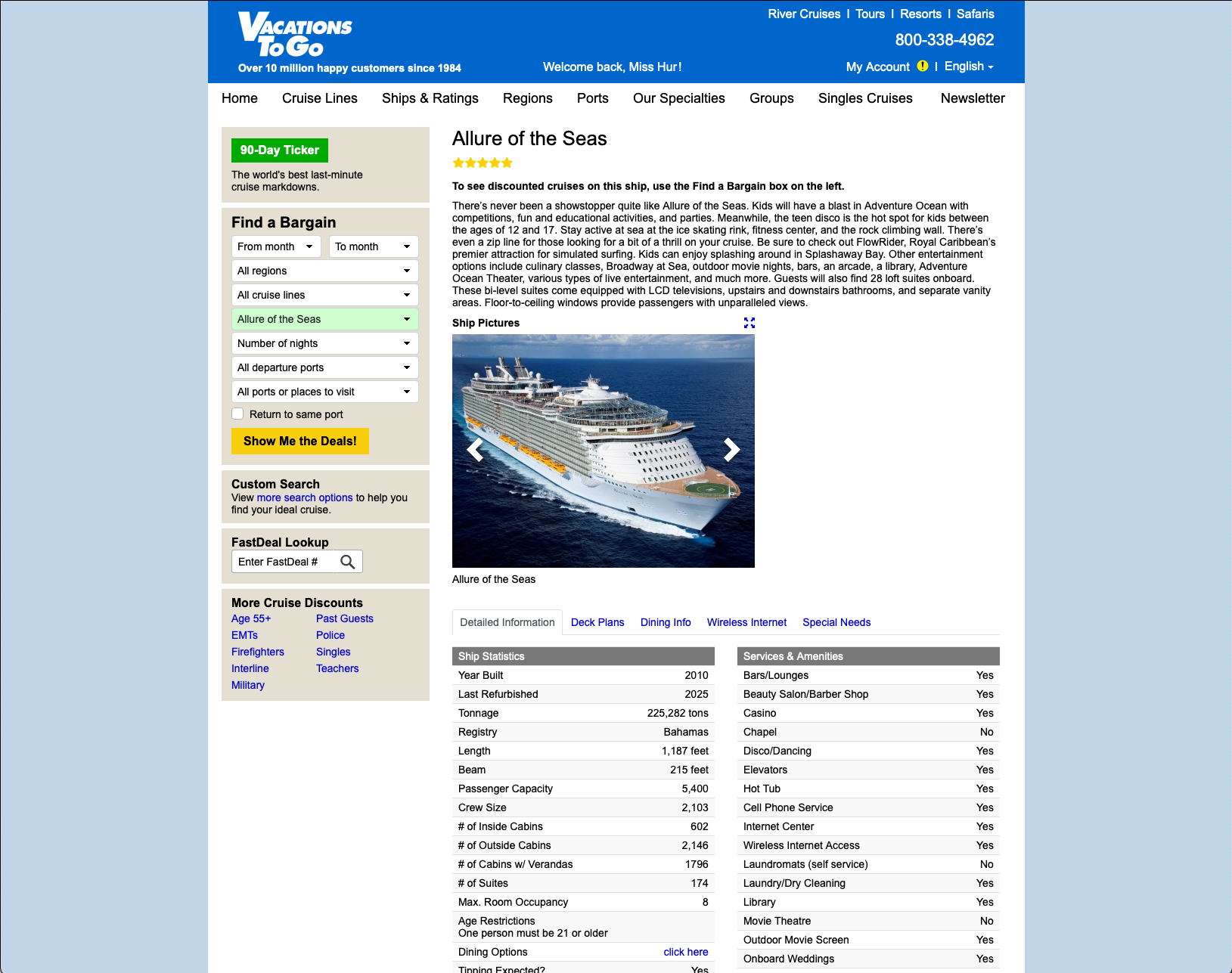
Vacations To Go — ship detail page


- Venues are described in long editorial paragraphs — the reader has to scan prose to find which restaurants exist, what they cost, and where they are.
- No filtering. Complimentary vs. cover charge, meal times, and deck location are all buried in the text.
- Ad units and an editor rating occupy the top of the page before any venue information appears.

- Every venue is a card carrying the same four data points: category, pricing, deck, and service times. Scannable at a glance.
- Two filter rows — dining type, hours, and pricing — narrow 19 venues down to what's relevant to the user.
- Menus link out directly from the card, so the decision and the detail live in the same place.
Same content, restructured around how users make the decision

- The deck map renders small and static beside a separate cabin gallery — the two never connect.
- Cabin photos are grouped by category, but there's no way to tell which specific cabin on the map corresponds to which room.
- Color coding on the map has no legend visible at this scale.

- A side-profile ship diagram orients the user vertically before they pick a deck — spatial context first.
- Selecting a cabin surfaces its number, square footage, occupancy, and a 3D room view in place.
- Feature and stateroom filters plus a per-deck venue list answer "what's near this cabin" without leaving the map.
Deck selection, cabin detail, and venue proximity in a single view
03Design Process
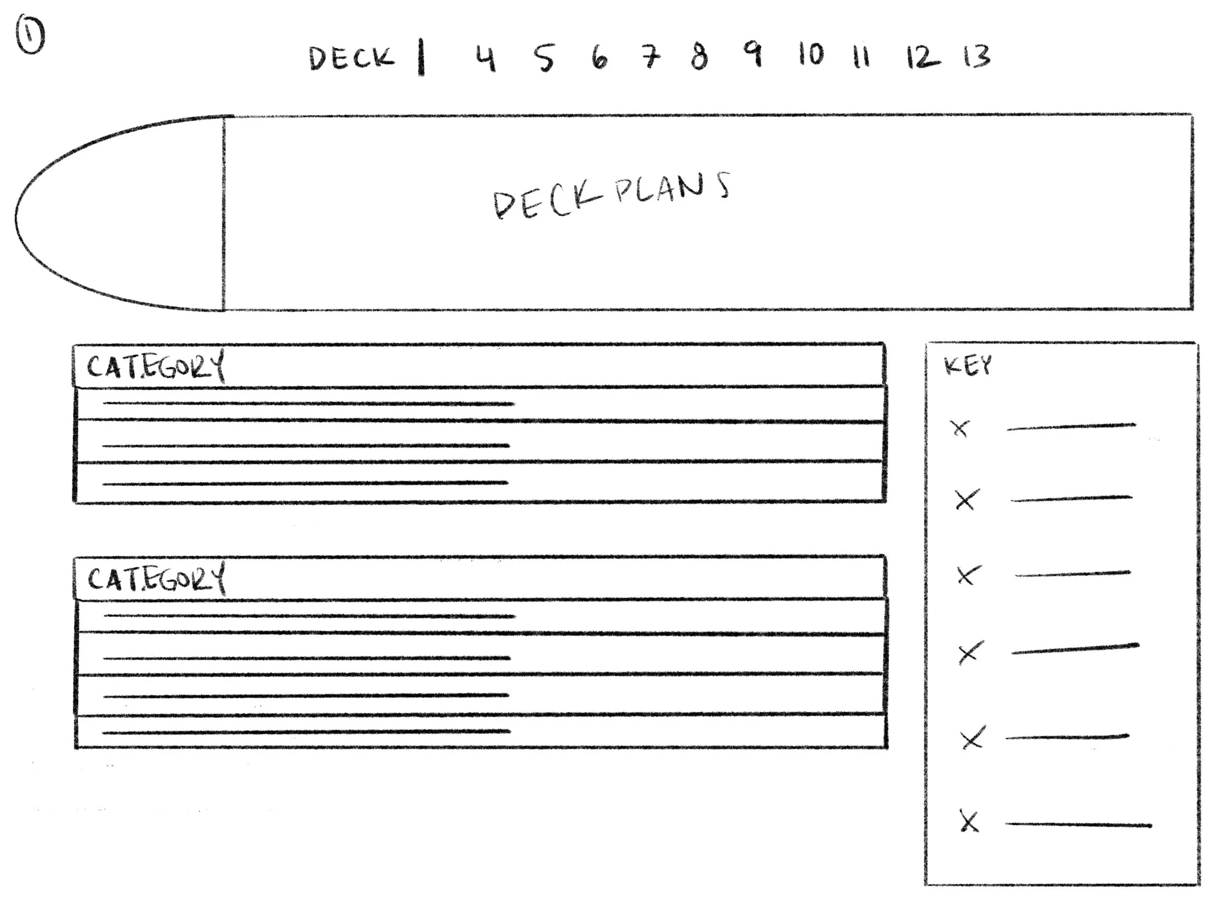
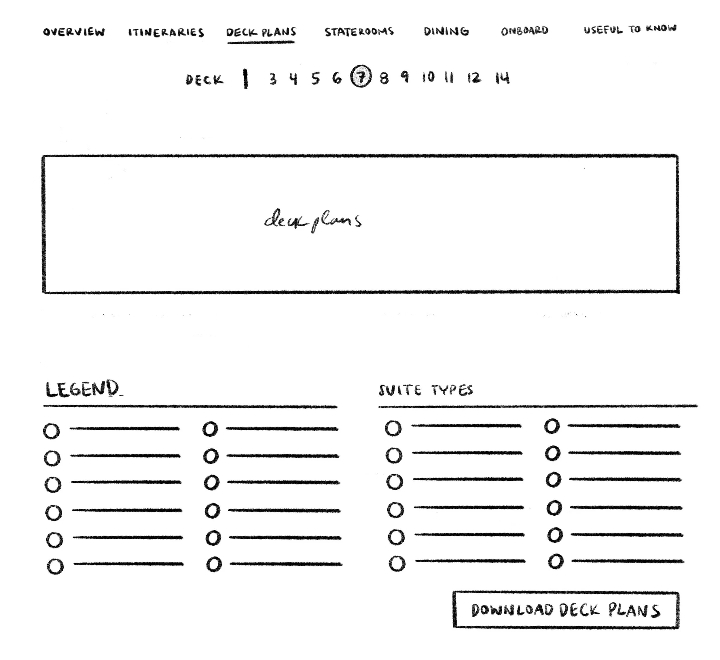
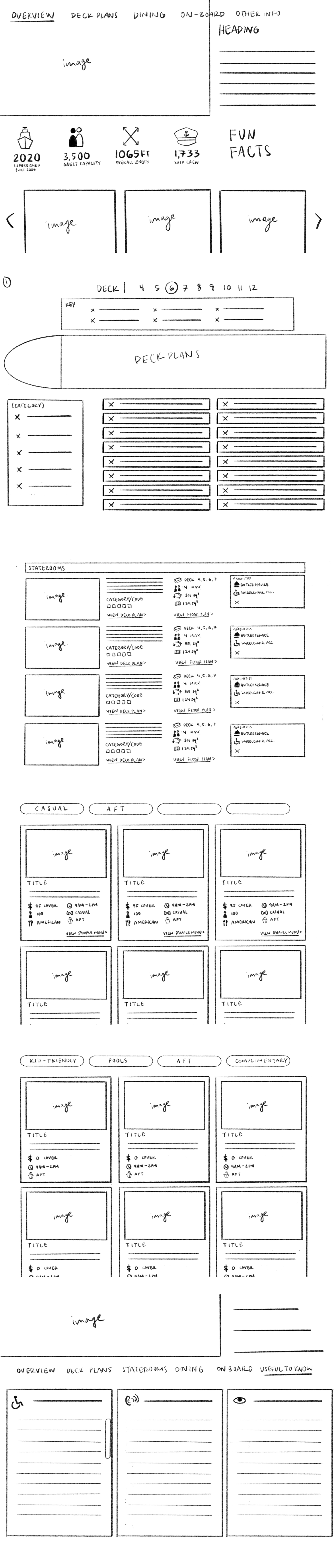
Sketches → FigmaBefore anything went into Figma, I worked through rounds of thumbnail sketches with my manager — navigation structure, how to surface information without overwhelming users, and where cruise booking sites were falling short. The deck plan selector, stateroom cards, and page navigation all changed shape before I touched a design tool.
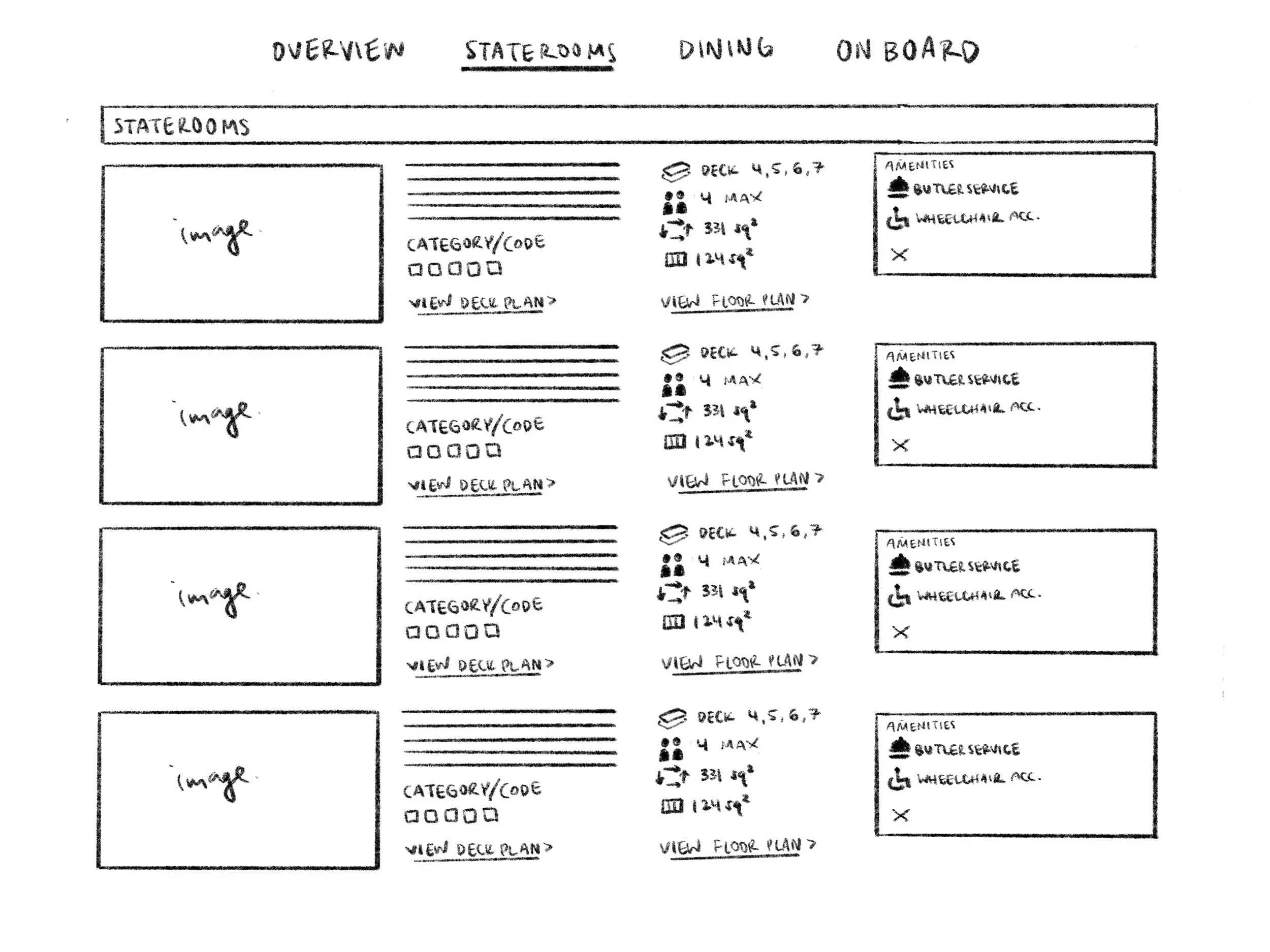
Staterooms — early thumbnail
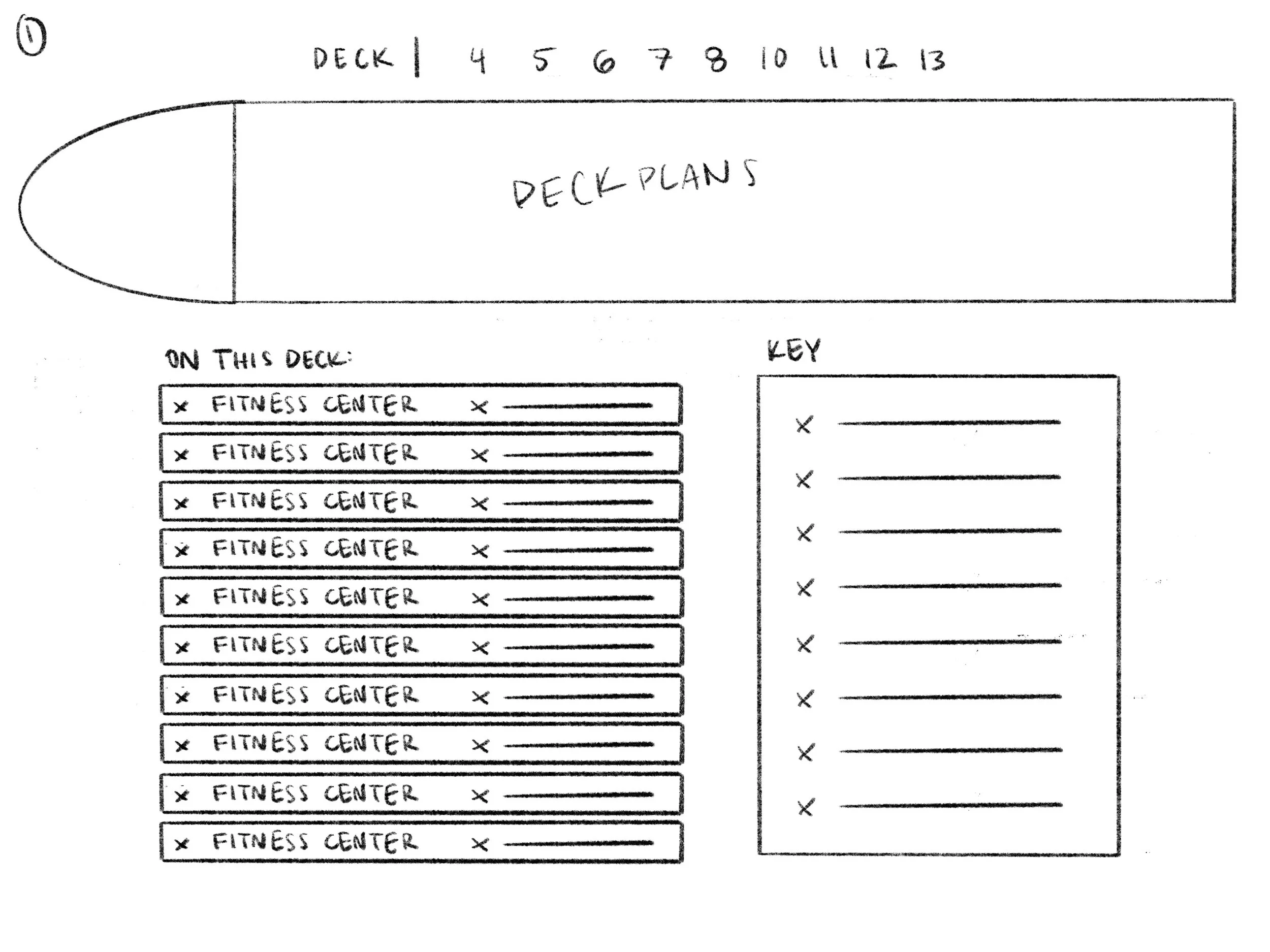
Deck plan selector — round 1
Deck plan selector — round 2
Deck plan selector — round 3
Hero & nav
Staterooms
Inherited from the previous senior UX designer. I wasn't convinced it was very intuitive but kept it in place.
Balancing density and clarity — I tested icons and formats to find what belonged on the card.
Very simple at this stage
Royal Caribbean's version was crowded and hard to parse. Mine was cleaner, but raised a bigger question: is this feature useful at all?
Landed on horizontal after researching other cruise sites. Later shifted to vertical for zoom.
Still learning the design system — pills are overused here, adding noise rather than clarity.
The filter logic and content structure took real work, and that groundwork held. The visual execution leaned too hard on pills and tags.
Scroll within the frame
That changed when we brought on a new senior UX designer. She introduced me to tokens, design systems, and what it means to prepare a file for handoff. It reframed the work — less about making screens, more about building something others could use and build on.

Cleaner and more polished, with stronger serif typography. It had to stay flexible — this design applies across every ship.
Still in use. The question of whether it was the right interaction pattern remained open.
Better organized with a cleaner pricing section. Still too many pills, and some icons added clutter.
Selecting a month above now highlights it in the schedule below. Still asking whether this is useful to a customer.
A significant shift — vertical orientation plus a side-profile animation showing the current deck. Much more spatially intuitive.
Still too many pills. The visual direction was improving but the execution wasn't there yet.
Better, but still far from the clean, luxury aesthetic we wanted. Another pass was coming.
Scroll within the frame
From there I worked more independently, moving away from Figma as my primary design tool and using Claude Code to explore new ways of displaying information. Another developer built out the booking process and cabin selection while I pushed the ship information pages further.
I was hitting a wall — the senior designer had no bandwidth, and earlier sketches we'd been confident in were starting to feel uncertain. My supervisor suggested I try AI. I used Claude to generate layout options and explore directions I hadn't considered.
Fewer pills, more intentional text placement. The cards started to feel like they had a clear hierarchy.
Where it became genuinely interactive. Now a combined map and schedule, comparing deployment across ships in the same class.
Continued pushing toward the simplest, least confusing way to click through decks and orient on the ship.
Cards became simpler. Detail moved into a popup on click, pulling from cruise line data. Less surface noise, more depth on demand.
Also simplified, and moving toward a more editorial format — signalling there's content to scroll to rather than front-loading it.
Scroll within the frame
The current version continues to evolve beyond what's shown here — see comparisons for most recent build.
04Icon Illustrations
During the early stages of the platform, I developed a custom icon set for the search filters. As the product evolved under new creative direction, the visual language shifted significantly. These icons weren't ultimately used in the final product, but the process of designing a cohesive illustration system informed how I think about visual communication at a system level.



















Tools Used
Figma · Figma Make · Procreate · Claude · Claude Code · Squarespace